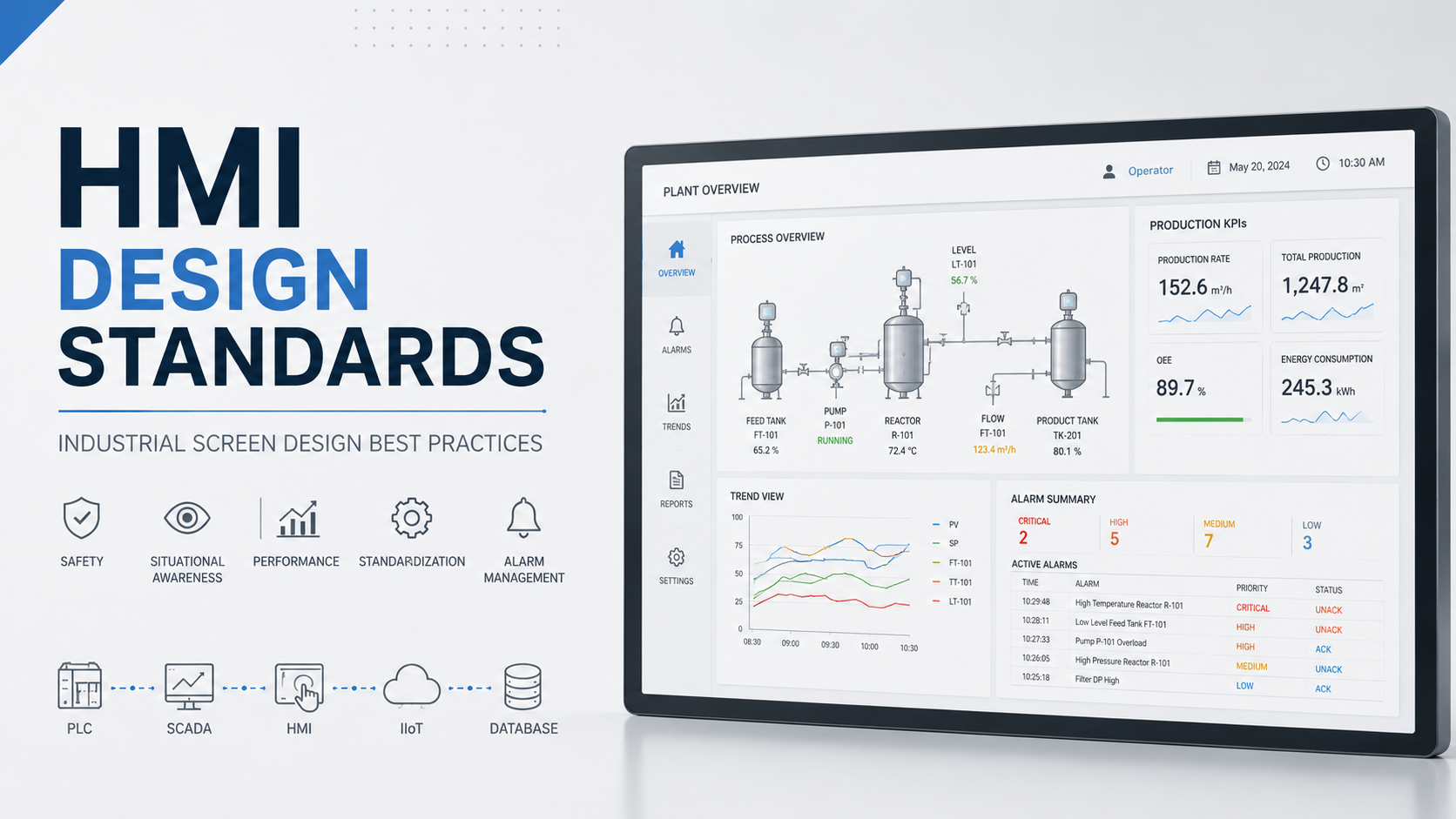
Human-machine interfaces are the control center of modern industrial automation. When designed poorly, they cause operator errors, missed alarms, and costly downtime. When designed well, they become powerful tools that keep plants running safely and efficiently.
This guide covers everything you need to know about HMI design standards, including ISA-101, High Performance HMI principles, color standards, alarm management, and layout best practices.
What Are HMI Design Standards?
HMI design standards are structured guidelines that define how operator interfaces should look, behave, and communicate information in industrial environments. They cover everything from color use and screen layout to alarm prioritization and navigation structure.
These standards exist because industrial operators make time-critical decisions based on what they see on screen. A poorly designed HMI can delay response times, cause alarm fatigue, and increase the risk of serious incidents.
Core objectives of HMI design standards include:
- Improving operator decision-making speed and accuracy
- Reducing human errors during normal and abnormal operations
- Enhancing situational awareness across the plant
- Standardizing screen design across multiple facilities
- Supporting faster operator training and onboarding
Why HMI Design Standards Matter in Industrial Automation
Bad HMI design is not just an aesthetic problem. It directly affects safety, productivity, and uptime.
Operator Errors Are Reduced
When screens follow consistent standards, operators recognize patterns faster. Alarm conditions are easier to identify. Equipment status is clear at a glance. Troubleshooting becomes systematic rather than guesswork.
Plant Safety Improves
Standardized HMI design supports early fault detection. Operators spot developing issues before they become emergencies. During abnormal situations, well-designed screens guide the operator toward the right response without creating confusion.
Productivity Goes Up
Faster navigation means less time hunting for information. Consistent layouts across screens reduce cognitive load. Operators spend more time managing the process and less time interpreting screens.
Training Time Drops
When every screen follows the same logic and visual language, new operators learn faster. There is no need to relearn navigation or color meanings each time they switch between workstations or facilities.
The Evolution of Industrial HMI Design
Understanding where HMI design came from helps explain why modern standards look the way they do.
Traditional HMI Design
Early HMIs were built to look impressive, not functional. Screens featured bright, saturated colors across every element. Animations were added for visual engagement. Three-dimensional graphics made equipment look realistic. Decorative backgrounds filled the screen with non-functional content.
The problem? All that visual noise made it harder for operators to spot what actually mattered.
Modern High Performance HMI
Today’s standard is the opposite of traditional design. Modern HMI design is minimalist and data-focused. Color is used sparingly and only carries specific meaning. Animations are reserved for actual state changes. The goal is to give operators fast access to the information they need without distraction.
High Performance HMI design is now the benchmark for serious industrial automation projects.
Major HMI Design Standards and Guidelines
Several formal standards and industry frameworks shape how HMI design is approached today.
ISA-101: Human Machine Interfaces for Process Automation
ISA-101 is the most widely referenced formal standard for industrial HMI design. Published by the International Society of Automation, it provides a comprehensive framework covering the entire HMI lifecycle from philosophy and design through implementation and management.
What ISA-101 addresses:
- HMI philosophy and objectives
- Screen hierarchy and navigation structure
- Consistent use of graphics, color, and symbols
- Alarm management integration
- Operator task analysis
- Ongoing HMI lifecycle management
ISA-101 is not just a design checklist. It defines how organizations should think about HMI from a management perspective, ensuring that design decisions are intentional, documented, and maintained over time.
Key ISA-101 principles:
| Principle | Description |
|---|---|
| Consistency | Same visual language across all screens |
| Hierarchical navigation | Clear top-down screen structure |
| Situational awareness | Design supports operator understanding |
| Lifecycle management | HMI maintained and updated over time |
ASM Consortium Guidelines
The Abnormal Situation Management Consortium developed guidelines focused specifically on reducing operator overload during abnormal events. Their research showed that most industrial incidents are linked to poor operator response during developing situations, not equipment failure alone.
Core ASM recommendations:
- Design screens to highlight abnormal conditions, not clutter normal ones
- Reduce visual complexity during routine operations
- Use alarm prioritization to guide operator attention to the most critical issues first
- Support operators with clear procedural guidance during upset conditions
EEMUA Publication on Alarm Management
EEMUA guidelines address alarm management as part of broader HMI design. The focus is on alarm philosophy, meaning every alarm must have a defined purpose, priority, and required response.
Key guidance from EEMUA:
- Avoid alarm floods that overwhelm operators
- Use color meaningfully for alarm priority, not decoration
- Write alarm descriptions that tell operators what action to take
- Review and rationalize alarms regularly to eliminate nuisance alarms
High Performance HMI Design Principles
High Performance HMI is a design philosophy built on the idea that screens should support fast, accurate operator response. It is now the industry standard for serious industrial automation projects.
Use Gray as the Primary Color
The single most important shift in modern HMI design is moving away from color-rich screens toward gray-dominant ones.
Gray works because it creates a neutral baseline. When everything is gray during normal operations, any deviation immediately draws the eye. A yellow warning or red alarm stands out against gray in a way it never could against a screen already filled with blue pipes, green tanks, and orange conveyors.
Recommended color usage:
| Color | Meaning |
|---|---|
| Gray | Normal condition |
| Yellow | Warning |
| Orange | Abnormal state |
| Red | Critical alarm |
| Blue | Operator action required |
| White | General information |
| Green | Use sparingly, on/off confirmation only |
The biggest mistake engineers make is using green to mean “good” everywhere. Green should be used minimally because the absence of red or yellow already communicates that conditions are normal.
Create a Clear Visual Hierarchy
Every HMI system should have a defined screen hierarchy that guides operators from broad plant overview down to specific equipment detail.
Standard five-level hierarchy:
- Level One — Plant Overview: Full facility summary, major KPIs, overall health
- Level Two — Area Overview: Production zones, process areas, system groups
- Level Three — Unit Overview: Specific process units, detailed equipment groupings
- Level Four — Equipment Detail: Individual tag values, control loops, setpoints
- Level Five — Diagnostic Screens: Maintenance data, calibration, fault history
Operators should be able to navigate up and down this hierarchy quickly without losing context of where they are in the plant.
Display Information, Not Decoration
Every element on an HMI screen should earn its place by carrying useful information. If it does not help the operator understand the process or make a decision, it should not be there.
Remove from your screens:
- Excessive pipe and vessel graphics that add no process value
- Animations that run continuously during normal operations
- Decorative backgrounds, gradients, and textures
- Logos, banners, or marketing elements
Focus your screen real estate on:
- Real-time process values and trends
- Key performance indicators
- Equipment status indicators
- Alarm and alert summaries
Improve Situational Awareness
Situational awareness means the operator understands not just the current state of the process but also where it is heading and what could go wrong next.
Good HMI design supports all three levels of situational awareness:
- Perception: What is the current state of each system?
- Comprehension: What does that current state mean for the process?
- Projection: What will happen next if current conditions continue?
Screens that only show current values support perception. Screens that include trend data, deviation indicators, and predictive alerts support all three levels.
HMI Screen Layout Standards
Consistent screen layout is one of the most practical ways to improve operator performance. When every screen follows the same structure, operators spend less time looking for information.
Header Section
The header appears at the top of every screen and provides orientation and context.
Header should always include:
- Screen title and current process area
- Date and time (synchronized to plant clock)
- Current user or operator ID
- Navigation breadcrumb showing position in screen hierarchy
Main Process Area
This is the largest section of the screen and should contain the core process visualization.
Best practices for the main process area:
- Arrange equipment in logical process flow order (left to right or top to bottom)
- Use consistent spacing between elements
- Display tag values in a readable font at appropriate size
- Avoid overlapping graphics or crowded layouts
- Keep background gray with minimal color until state changes occur
Navigation Area
The navigation section provides consistent access to key screens from any location in the HMI.
Recommended navigation elements:
- Home button (returns to plant overview)
- Alarm summary with active alarm count
- Trend viewer access
- Common screen shortcuts for frequently visited areas
- Current screen location indicator
Alarm Area
The alarm section gives operators a persistent view of active alerts without requiring them to navigate away from their current screen.
Alarm area display requirements:
- Show the most recent or highest priority active alarms
- Include alarm priority level (critical, high, medium, low)
- Display timestamp of alarm activation
- Provide one-click access to the full alarm management screen
HMI Color Standards
Color is one of the most powerful tools in HMI design and one of the most commonly misused.
Understanding Industrial Color Coding
The purpose of color in HMI design is not to make screens look good. Color is a communication tool. Every color carries a specific meaning, and that meaning must be consistent across every screen in the system.
Standard industrial color meanings:
| Color | Standard Meaning | Usage |
|---|---|---|
| Gray | Normal operating condition | Primary background and equipment color |
| Yellow | Warning, approaching limit | First level alert |
| Orange | Abnormal state, off-spec | Pre-alarm condition |
| Red | Critical alarm, unsafe condition | Highest priority alert |
| Blue | Operator action required | Interactive elements |
| White | Informational display | Labels, general text |
| Green | Running or on confirmation | Minimal use only |
Common Color Mistakes to Avoid
Too many colors on one screen. When everything is colorful, nothing stands out. Operators lose the ability to use color as a signal because color has become visual noise.
Using green for everything normal. Green should not fill pipes, tanks, and equipment just because the process is running. Gray handles normal state. Green should appear only as a deliberate confirmation signal.
Excessive flashing. Flashing is one of the strongest attention signals available. When it is overused, operators start ignoring it. Reserve flashing only for the most critical, time-sensitive alarms where immediate action is required.
HMI Typography Standards
Font choices affect readability under stress, across different lighting conditions, and at various screen distances.
Recommended Fonts for Industrial HMI
Choose clean, sans-serif fonts designed for screen readability:
- Arial — Widely available, clear at small sizes
- Segoe UI — Excellent screen readability, modern appearance
- Tahoma — Strong legibility, compact spacing
Avoid decorative, serif, or condensed fonts. Operators should never have to work to read a value during a process upset.
Font Size Recommendations
| Data Type | Size Guidance |
|---|---|
| Critical process values | Large, immediately readable |
| Supporting data and secondary values | Medium, clearly legible |
| Screen labels and identifiers | Consistent, never smaller than minimum readable size |
| Alarm text | Clearly readable without zooming |
Consistency matters more than specific point sizes. Whatever sizing system you choose, apply it uniformly across all screens.
Alarm Management Design Standards
Poor alarm design is one of the leading contributors to industrial incidents. A well-designed alarm system guides operator attention. A poorly designed one creates fatigue and causes operators to miss what actually matters.
Effective Alarm Display Design
Alarms should be designed around the concept of alarm rationalization, meaning every alarm must have a documented reason for existing, a defined priority level, and a clear required response.
Alarm priority levels:
| Priority | Description | Required Response Time |
|---|---|---|
| Critical | Immediate safety or equipment risk | Immediate |
| High | Significant process deviation | Within minutes |
| Medium | Process attention required | Within the hour |
| Low | Informational, no immediate action | During normal review |
Alarm Banner Best Practices
The alarm banner is the persistent alarm display visible on every screen.
- Show only active, unacknowledged alarms in the banner
- Sort by priority, then by time
- Use color coding consistent with the overall color standard
- Include a clear count of total active alarms
- Avoid scrolling banners that make operators wait to see the full alarm list
Avoiding Alarm Floods
An alarm flood occurs when more alarms activate than an operator can reasonably manage. Industry guidelines suggest that more than ten alarms in ten minutes constitutes a flood situation.
Strategies to prevent alarm floods:
- Rationalize all alarms before deployment, remove nuisance alarms
- Use alarm shelving for known, temporary conditions
- Implement alarm suppression during startup and shutdown sequences
- Review alarm KPIs regularly to identify problem areas
Industrial Dashboard Design Standards
Dashboards provide a high-level summary view that supports fast situational awareness without requiring operators to drill into individual screens.
KPI Dashboard Guidelines
Essential KPIs for industrial dashboards:
- Overall Equipment Effectiveness (OEE)
- Production rate vs. target
- Current downtime status and cumulative shift downtime
- Energy consumption per unit of production
- Active alarm count by priority
Display KPIs using simple, direct visualizations. Avoid overly complex charts. A number with a status color and a trend arrow communicates faster than a pie chart.
Trend Visualization Standards
Trends are one of the most valuable tools available to an industrial operator. They show not just where the process is but where it has been and where it is heading.
Effective trend design principles:
- Show a minimum of one hour of historical data by default for process trends
- Include setpoint and alarm limit lines on the same trend chart
- Use consistent time scales across similar trends for easy comparison
- Allow operators to zoom and pan without losing access to live data
- Label all trend lines clearly with tag name and engineering units
Common HMI Design Mistakes to Avoid
Overuse of Colors
Using too many colors eliminates color as a meaningful communication tool. Every color must have a defined meaning and that meaning must be applied consistently.
Too Many Alarms
More alarms do not mean better monitoring. They mean operators stop trusting the alarm system. Rationalize every alarm before it goes into service.
Complex Navigation
If operators need more than three clicks to reach any screen they need during normal operations, the navigation structure needs work. Deep, confusing navigation trees cost time and create stress during upset conditions.
Poor Data Organization
Group related information together. Process values for a pump should appear together with its status, speed, flow output, and alarms. Scattering related data across the screen forces operators to search for what they need.
Excessive Animations
Continuous animations pull the eye away from real state changes. Reserve motion for events that require operator attention.
Inconsistent Screen Layouts
When screens look different from each other, operators lose time re-orienting every time they navigate to a new area. Apply the same layout template across all screens in the system.
Lack of Standardization Across Facilities
Multi-site operators suffer when each facility has its own HMI design approach. A standardized design system lets operators move between sites without relearning the interface.
HMI Design Standards Across Industries
Different industries apply HMI design standards to specific operational challenges.
Manufacturing Plants focus on production rate, equipment status, and downtime tracking. High-performance HMI supports shift handover and rapid fault identification on production lines.
Water Treatment Facilities prioritize process monitoring across pumping, treatment, and distribution systems. Clear status displays and alarm management are critical because upsets affect public safety.
Oil and Gas Operations require robust high performance HMI design due to the safety-critical nature of operations. ISA-101 compliance is often a regulatory and operator requirement.
Pharmaceutical Production demands detailed batch and process monitoring with strict audit trail requirements. HMI design must support compliance as well as operational performance.
Food and Beverage Processing balances production efficiency with sanitation and compliance monitoring. Dashboards combining OEE with quality indicators are common in this sector.
HMI Design Checklist for Engineers
Before deploying any HMI system, verify the following:
- Screen hierarchy is defined and documented at all levels
- Color standard is established and applied consistently across all screens
- Alarm priorities are defined for every alarm in the system
- All navigation paths are tested and require three clicks or fewer
- Font choices and sizes are consistent and readable at operating distance
- Trend displays include historical data, setpoints, and alarm limits
- Operator user acceptance testing has been completed
- ISA-101 compliance has been reviewed against project requirements
- Alarm rationalization is complete with no nuisance alarms in service
- Documentation is complete including screen index and alarm philosophy
Future Trends in HMI Design Standards
Responsive HMIs
Modern HMI platforms are moving toward responsive design that adapts layouts for different screen sizes, including large displays, standard workstations, and portable devices.
Mobile HMI Access
Operators and engineers increasingly need access to process data away from fixed workstations. Mobile HMI design is evolving its own set of standards around simplified navigation and touch-optimized layouts.
AI-Assisted Visualization
Artificial intelligence is beginning to play a role in HMI by surfacing insights that operators might otherwise miss. AI layers can flag developing trends, suggest responses to abnormal situations, and filter alarm noise in real time.
Predictive Analytics Integration
HMI screens are increasingly displaying predictive maintenance indicators alongside live process data, giving operators advance warning of equipment issues before they cause downtime.
Augmented Reality HMIs
AR overlays on physical equipment represent the next frontier of HMI design. Field operators using AR headsets or tablets can see live process data overlaid on actual equipment, combining the benefits of physical presence with digital monitoring.
Key Takeaways
HMI design standards exist to protect operators, improve plant performance, and reduce the risk of costly incidents. The shift from traditional colorful, decorative screens to modern High Performance HMI design represents one of the most significant improvements in industrial operations over the past two decades.
The most important principles to apply:
- Follow ISA-101 as your foundational framework
- Use gray as your primary color and reserve other colors for specific meanings
- Build a clear screen hierarchy and make navigation fast and intuitive
- Rationalize every alarm before it goes into service
- Design for situational awareness, not just current-state display
- Standardize consistently across all screens and all facilities
- Test designs with actual operators before deployment
Organizations that invest in proper HMI design see measurable returns in reduced downtime, faster operator response, lower training costs, and improved plant safety records.
Turn Complex Industrial Challenges Into Reliable Automation Solutions
From machine-level controls to plant-wide automation systems, AutomatexLab helps manufacturers design, implement, and optimize automation solutions that improve productivity, visibility, and operational performance.
Get expert support for:
• PLC & SCADA Systems
• HMI Design Standards Implementation
• Factory Automation Projects
• System Integration
• Industrial Data & Analytics
FAQs
ISA-101 is a formal standard published by the International Society of Automation that defines best practices for designing, implementing, and managing human-machine interfaces in process automation environments.
High Performance HMI is a design philosophy that prioritizes operator performance through minimalist, data-focused screen design. It uses gray as the primary color, restricts color use to meaningful state changes, and eliminates decorative graphics.
The standard industrial palette uses gray for normal conditions, yellow for warnings, orange for abnormal states, red for critical alarms, blue for operator actions, and white for general information. Green should be used minimally.
Gray creates a neutral visual baseline. Abnormal conditions expressed in yellow, orange, or red stand out immediately against gray, allowing operators to spot deviations faster than on color-saturated traditional screens.
Well-designed HMIs help operators detect developing issues earlier, respond to alarms faster, and navigate to the right information during upset conditions. This reduces the chance of abnormal situations escalating into incidents.
Situational awareness refers to the operator’s understanding of current process state, what that state means, and what is likely to happen next. HMI design supports situational awareness through trends, deviation indicators, and contextual alarm information.